
XIV Gothic Custom Typeface
St. Louis Community College – 2025

In developing this custom typeface, I sought to bridge the gap between graphic design and sculptural art. Leveraging my background in technical theatre, I approached the project as an exploration of how typography can transcend the digital screen to become a tactile experience. My process began with a deep dive into materiality, selecting pleated red tulle for its ability to create dramatic contours and fluid movement. By fanning and manipulating the textile, I transformed static letterforms into dynamic sculptures, allowing the organic nature of the fabric to dictate the visual rhythm of the alphabet.


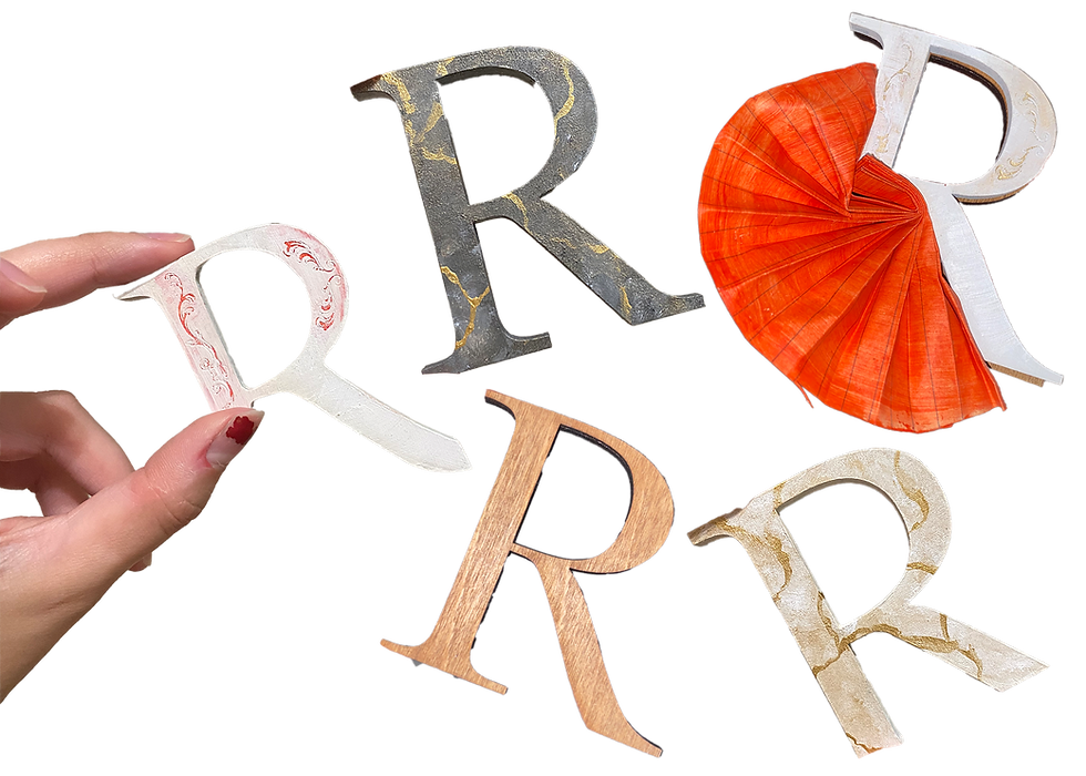
The foundation of this project is built on the intersection of strength and elegance. To support the weight and volume of the tulle, I hand-drafted a high-contrast serif typeface characterized by consistent line weights and a sturdy, symmetrical architecture. This 'regal' aesthetic was purposeful; the classic serif structure provides a sophisticated anchor for the more volatile, expressive fabric. By digitizing these forms in Adobe Illustrator and engineering them into multi-layered, laser-cut wood components, I ensured that the physical base offered both the depth and the structural 'nooks' necessary for seamless fabric integration.
Ultimately, this project is about blending the elegance of traditional typography with the grit of scenic design. It’s a mix of classical serifs and avant-garde materials that really commands attention. By moving from a digital sketch to a laser-cut physical object, I was able to create a high-impact visual that works for anything from a gallery setting to high-fashion branding. It shows my process of taking a complex idea and managing every step—from the first drawing to the final paint stroke—to create something that challenges what people expect from a typeface.

